Creating Prefabs
Prefabs in WaveMaker are reusable application components that encapsulate UI, logic, and service interactions into a modular unit. Once created, a Prefab can be embedded seamlessly into applications and reused across projects. WaveMaker provides a guided workflow to create, configure, test, and publish your own Prefabs.
Creating a New Prefab
To build your own Prefab:
- Open the Project Dashboard and navigate to the Prefab tab.
- Click Create to start a new Prefab.
- Enter a meaningful Name, choose an Icon for the Prefab avatar, and add a Description.
- Review the Package and Copyright information, make adjustments if needed, and click Save to proceed.
Configuring the Prefab
After creation, configure your Prefab under Project Configurations → Settings → Config Prefab. Configuration options are grouped for convenience:
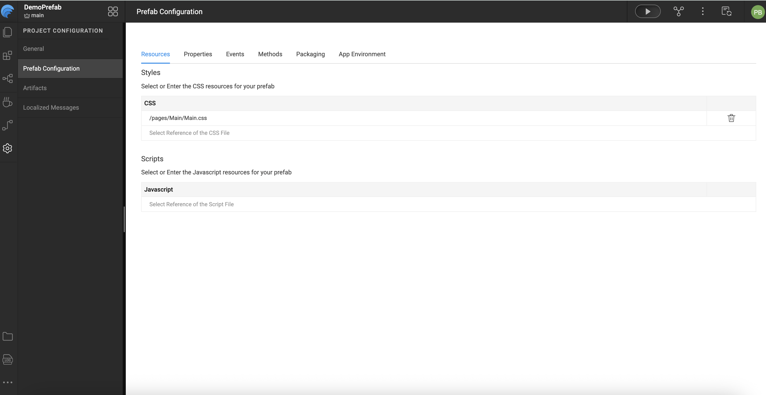
Resources
- Style: Apply CSS styles to the Prefab or include your own style files.
- Script: Add JavaScript files that need to run before the Prefab load.
Defining Properties
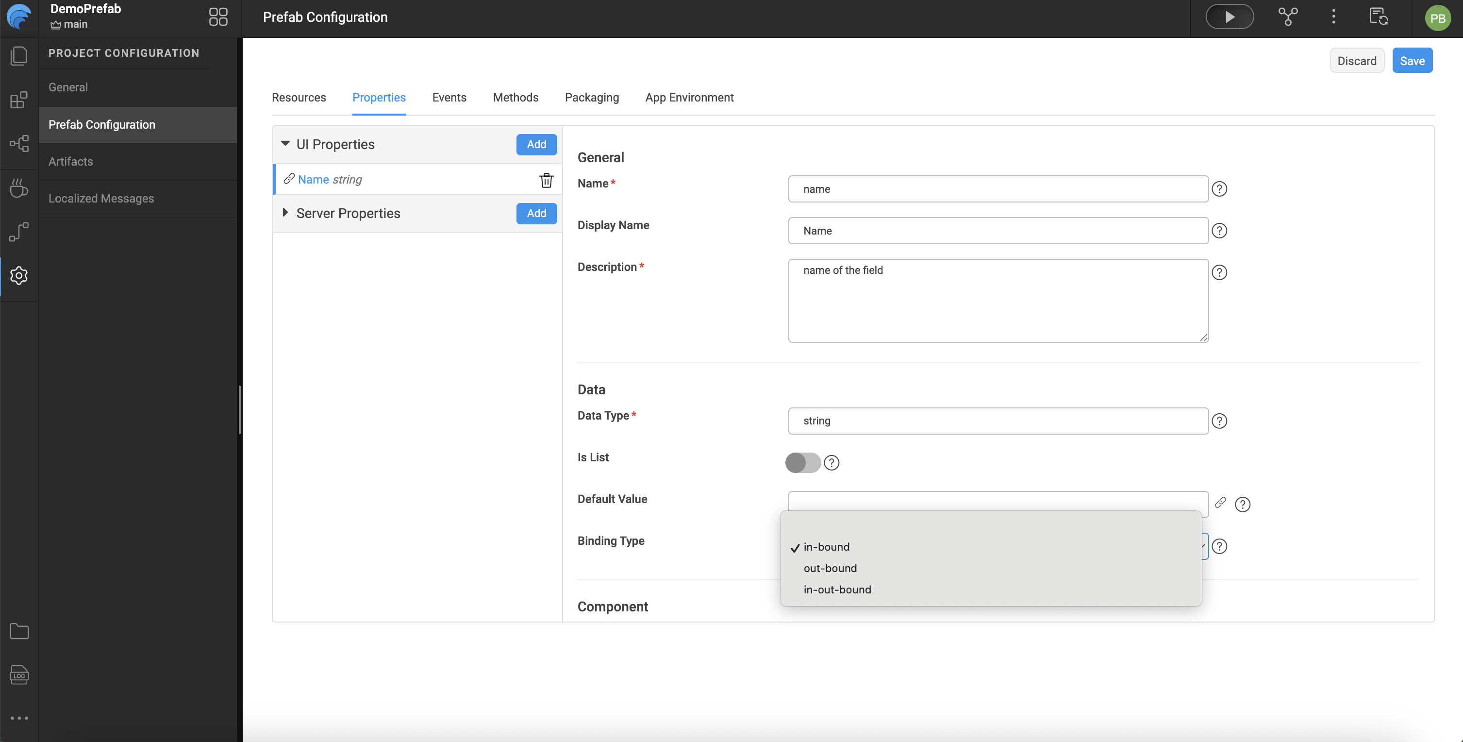
WaveMaker allows you to define properties that users of the Prefab can set or bind.
UI Properties
UI properties appear in the Properties panel when the Prefab is used in an application. These include:
- Name: Internal identifier (lowercase).
- Display Name: Label shown in the Properties panel.
- Description: Help text for the property and documentation generation.
- Data Type: Type of value accepted by the property.
- Default Value: Fallback value if none is provided.
- Binding Type: Controls how the property can be bound:
in-bound— Accepts incoming values.out-bound— Outputs values for binding.in-out-bound— Supports both.
- Widget Settings: Defines how the property appears in the panel (widget type, visibility, disabled state, and show conditions).
Server Properties
Server properties are set using backend services or Java and typically include elements like authorization tokens or other server-side values. These include:
- Name
- Default Value
Defining Events
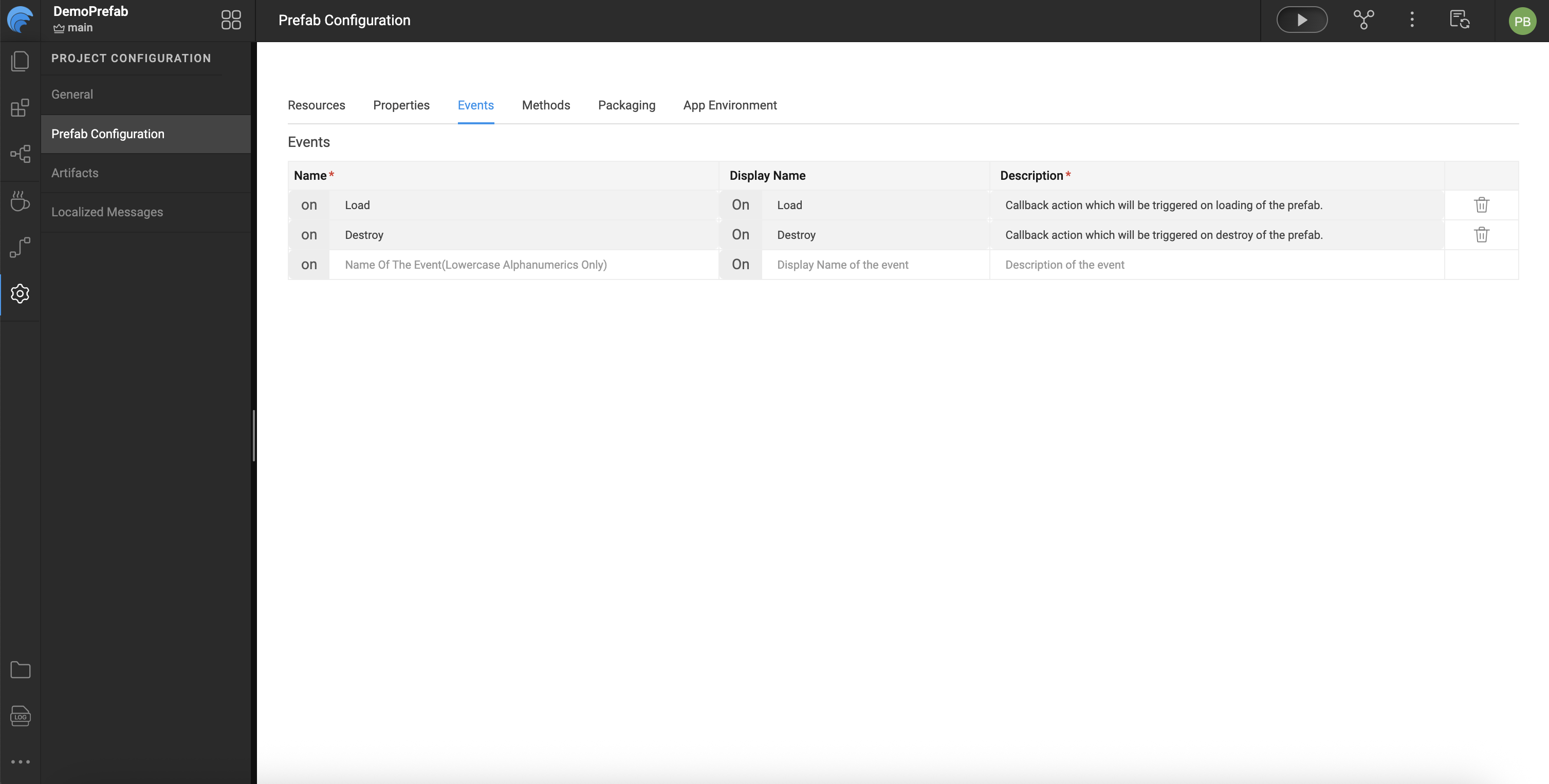
Prefabs support events that application developers can handle when using the Prefab:
- onLoad — Triggered when the Prefab is first added to a page or when the page loads.
- onDestroy — Triggered when the Prefab is removed or the page closes.
- Custom Events — Additional events defined by the Prefab developer can be added and exposed in the Events tab.
Each event includes:
- Name — Event identifier (prefixed with
on). - Description — Used in documentation when the Prefab is published.
Event Flow Notes:
onPropertyChangeis triggered when a property changes internally but is not exposed to the end user.- Custom events must be explicitly triggered within the Prefab using code such as:
Prefab.on<event_name>($event, $data)
Defining Methods
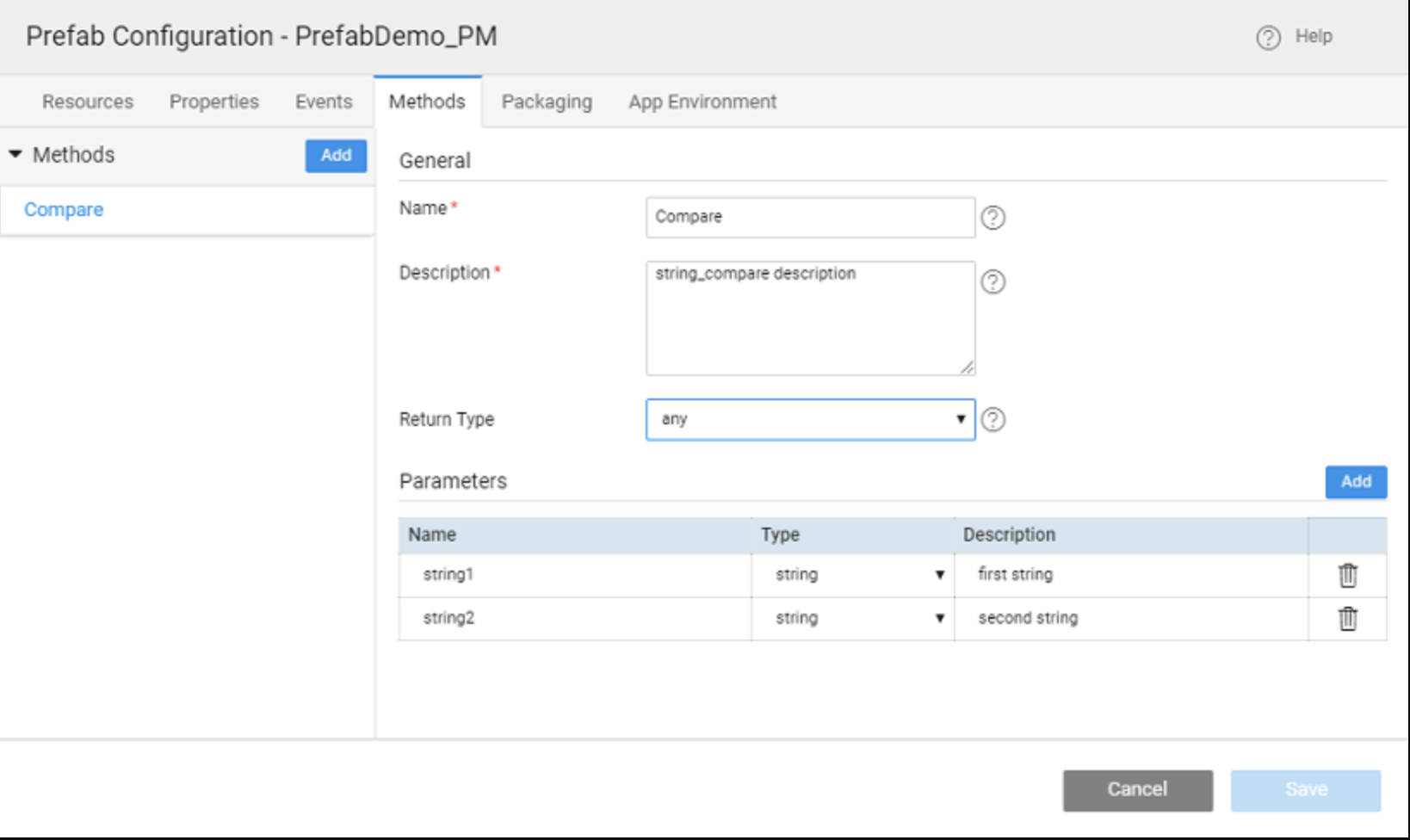
Developers can add reusable functions to Prefabs:
- Name — Method name.
- Description — Used for Prefab documentation.
- Return Type — Data type returned by the method.
- Parameters — Inputs required by the method.
Methods can be invoked in applications using:
Page.<prefab_name>.<method_name>(<parameters>)
If a method is referenced but not defined, WaveMaker will generate a placeholder in the Prefab’s script tab.
Testing the Prefab
WaveMaker includes a built-in Preview option for testing Prefabs:
- Enter values for inbound properties.
- View results via the outbound properties tab.
- Invoke defined methods through the Methods tab.
- Observe triggered events from the Events tab.
Summary
WaveMaker Prefabs are modular, reusable components that encapsulate UI, logic, and service integrations. Once created, they can be packaged with a name and icon, tested via the built-in Preview for properties, methods, and events, and published to a project, workspace, team, or enterprise repository. Updates require incrementing the version number, with WaveMaker handling version conflicts and prompting projects to update. Prefabs streamline development by enabling drag-and-drop reuse across multiple applications.